
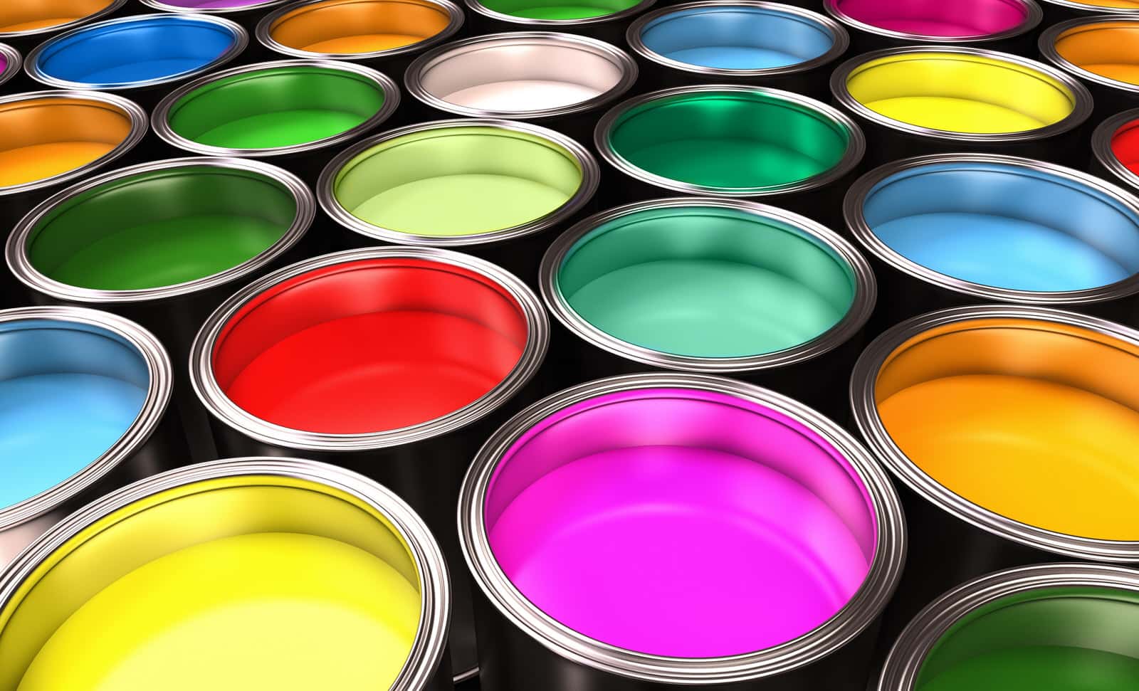
We all know what a splash of color does, right? It can make or break an image. Add the finishing touches to an otherwise bland idea. Or revolutionize the industry by creating a lifelong brand identity. Color coordination of websites is no different.
A splash of color could mean the difference between a big lead and a lead balloon. Imagine painting a room in bed and breakfast. Most quaint B&Bs share a few characteristics – sweet, neutral tones of perhaps yellow, robin’s egg blue, or taupe. You finish painting and start posting statuses on social media of your quiet spaces and calming interiors.
Two days later your first guest arrives to find their relaxing room to be nothing but hot pink.
Hot pink may soothe and relax you. The color might remind you of cherries or bubblegum, but it’s an overly aggressive color meant to be bold. Its shock value may turn off more people than it attracts.
Disconnects like the example above are what you want to avoid. We all know green lights mean go and red means stop.
Changing the two would be disastrous. In web design, personal preferences cannot be more important than attracting potential customers.
Choosing the right color palette is akin to the best search engine optimization tactics.
Brand logos receive unbelievable amounts of attention, from creative hours to oversight, and yet some companies drop the ball when it comes to connecting identities to websites.
Now that we know how important your site’s color scheme should present itself, here’s Valorous Circle’s quick 3-step process on choosing the colors patterns for your new web project.
1. Take Aim
Valorous Circle touts the importance of target market identification right off the bat. We can’t move past the first stage without it. Every target market comes with its own set of demographic information, and you guessed it – color pattern.
Did you know more men like blue than women, who prefer purple? And both genders equally despise brown? Exciting brands love using yellow while green is more environmental. Red is aggressive but engaging, and the colors of the rainbow show your diversity.
2. Be Rational
White is not a primary color, but using white space helps us spot the difference between style and essential information. While it’s true that there are brands with black and white logos, ideally, your website will feature your primary color more than 50 percent of the time.
Valorous Circle’s primary color is a lighter shade of blue. Our secondary color, seen about 25 percent of the site, is more navy. Our lettering, headers, buttons and transition spaces actively blend two colors before added a splash of orange accent. Accent colors are those that add some spice to the color scheme without distracting from the overall theme of the website.
3. Stand Out
Unfortunately, color coordination efforts are nothing new. One industry may see all its local competitors adopt the same color pattern. Construction companies or asphalt operations tend to use yellow and black (the color of their machinery) so there isn’t much distinction.
It’s always important to do a little digging on your neighbors before painting your house the same color. After all, you don’t want to confuse the mailman.
The colors in your logo must lay the foundation of your website. The power of color coordination is responsible for easily identifiable messaging. Email, social media, and outdoor advertising rely on consistency, and your site is no different.