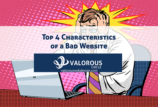
“I’ll know it when I see it” is a typical response when searching for something out of place. We don’t know what’s wrong, but something doesn’t sit right. With websites, however, it can be plain as day from the first second of viewing. Here are four characteristics of a bad website – and why it’s time for a change.
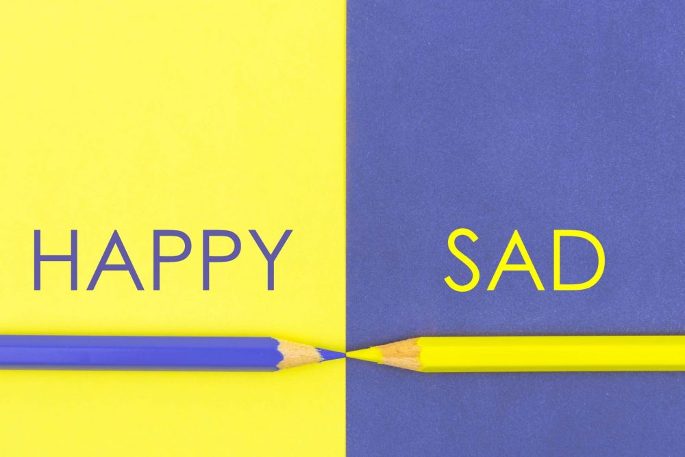
Color Discomfort
The color of your favorite sports team may not be the best choice when laying out your new website. Older sites tend to have gaudy color schemes with mixtures of hot pink and neon green on black, or yellow on well … anything.
Simply because a color contrasts well against another doesn’t mean it’s going to elicit a positive reaction.
Never underestimate the use of the basics – light shades of primary colors or white text on dark backgrounds and darker shades text set against white backgrounds.
Illiteracy & Readability
Our brains comprehend stunning amounts of information in short time frames. You must have clear, concise language on your website, absent of spelling errors or run-on sentences.
The worst spelling mistake can ruin the best design. Our brains may not be all wired to see the same artistic inconsistency, but many of us grow up with the same baseline of primary language education.
And while we do send text messages and write on Facebook walls using lols and slang, we know that seeing it on a website is shows immaturity and unprofessionalism.

Spacing Out
Simple websites tend to forget that there’s so much room. Unless you’re actively searching for news, nobody goes online to read mass amounts of text inside margins that fill one-third of the screen.
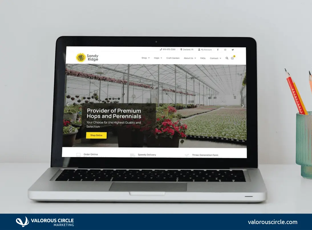
Branching out and using full bleed design adds depth and dynamism to your site. Once you expand to the edges of the browser window, and maybe add some texture, your whitespace (or negative space) serves a higher purpose. Images and icons on white backgrounds draw your eyes to what you want viewers to see and click.
Take Sandy Ridge Farms, a Valorous Circle client. Their primary header extends to the edges and pops with hops before leading you to three distinct icons, each with shadowing for depth.
Major Malfunction
Is your target market is anyone under the age of 40? If so, the overwhelming majority of your customers are viewing your site on a smartphone. Mobile usage is why you need to start planning on responsiveness.
Responsiveness relates to how well your site responds to changes in pixel width, i.e., from desktop to laptop to tablet to phone. In other words, one of the chief characteristics of a bad website is making someone have to two-finger zoom all of your pages because only the desktop version exists.